Carnet
This is a car security platform designed to provide rapid and secure communication between car owners, the local authorities as well as members of the car community at large. With advanced AI technology, it finds the safest spots for you to park your car and continue with your day’s activities. With carnet, you can receive updates on your car’s location and safety as well as your loved ones’ cars. It keeps you updated on the various risk levels of streets within the city and country at large, helping you make wiser decisions on where to park your car.
With Its report capability, you can communicate with car owners without the need of having their private contact details alerting them on the current status of their vehicles.

Project overview
Project
timeline
Role
Tools
Academic July-Oct 2021
2 months
UX Researcher, Design Strategy, UX/UI Designer
Figma, Invision, Adobe Photoshop, Adobe After Effects, Coral draw

Project breakdown
The project is centered on a comprehensive study on car theft in the USA and the current safety measures in place. The weaknesses of existing safety measures and more viable approaches to reducing the rate of car theft in society as well as helping the masses find a better solution to combatting the problem.
I have always wondered why such has lingered at an alarming rate, It aroused my curiosity and made me wonder why the rate of car theft had constantly increased based on statistics received on a yearly basis by the local authorities. I decided to take a different route to find a solution to this problem.
The whole project process can be summarized in 3 words “human-centered design”. This is a process where empathy for a client is used as a yardstick at every point of the design and research. I had to consider their pain points, emotions as well as the best viable solution while approaching this project.








Secondary Research
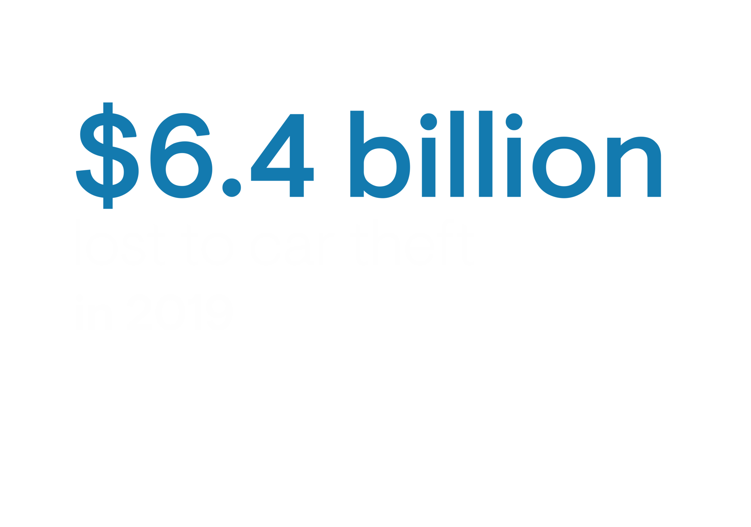
Car theft has posed a major threat in the world. In the USA the bureau released a preliminary analysis that indicates that the number of car thefts in 2020 totaled 873,080, a 9.2 percent increase compared with 2019 when its data showed that 799,644 thefts were recorded. This includes numerous break-ins into cars, stealing of valuable properties as well as high investment on unplanned car purchases. This has significantly affected every car owner.
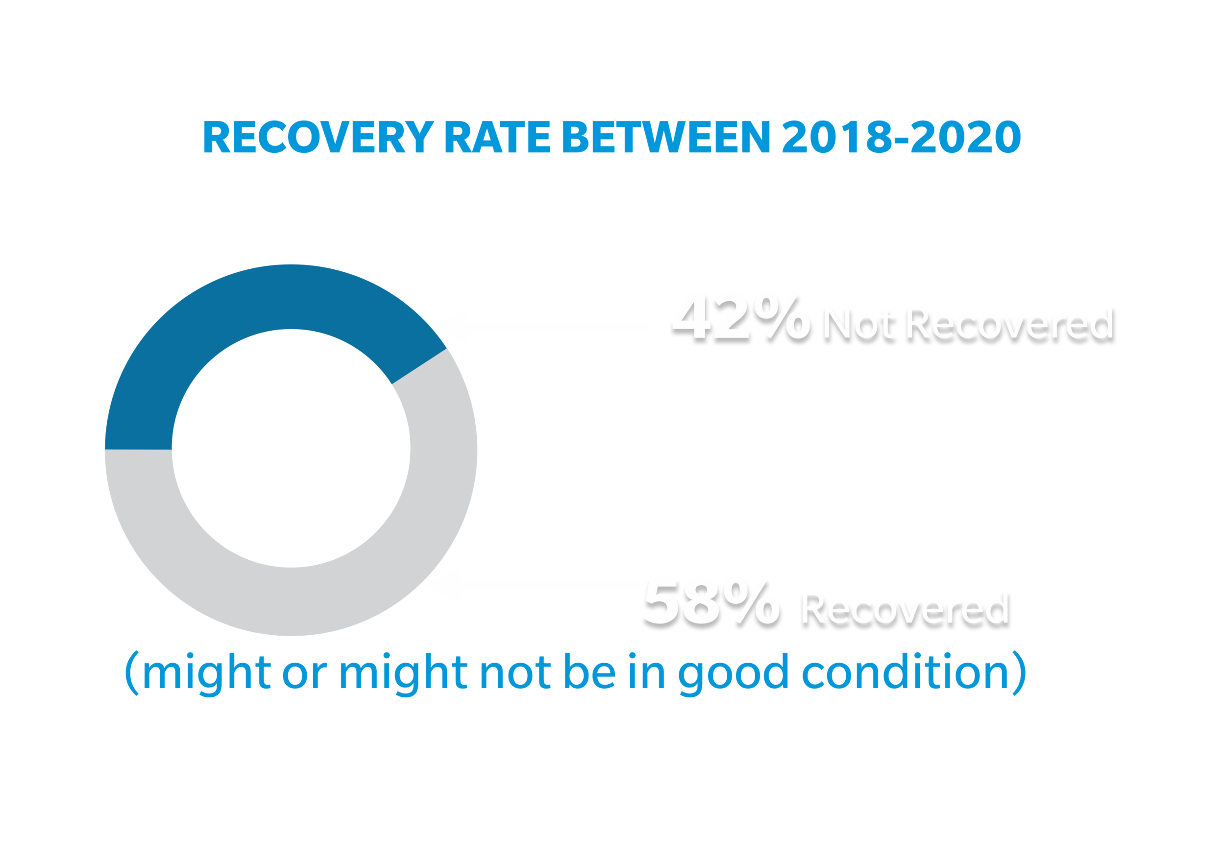
According to National Highway Traffic Safety Administration (NHTSA), approximately 42% of stolen cars are never recovered. Despite the huge investment in tracking devices and various solutions in the market, people still live in fear of losing their cars.

How might we...
Help car owners feel more confident about the location, safety, and security of their parked cars?
How can we alert car owners when their cars have been broken into or stolen, providing comprehensive information on the situation of their vehicles?
Primary Research
Qualitative research was conducted on car owners in the USA. The research captured the fears and thought processes of car owners. The research was centered around the security of their cars when parked in known and unknown locations. The research leaned on how best to alleviate the mental/financial stress that is associated with car theft.
This was done through a well-planned questionnaire distributed for viable information. From my findings, I got to understand their fear, pain points, and suggestions for an actual solution.


Primary Persona Secondary Persona Experience Map
From the research, I discovered some consistent fears, and pain points as I synthesized our researched data. Many had problems with finding the right spot to park their cars. after analyzing our data we came up with a persona that embodied our customers and stakeholders
On further research, It was imperative to have a second persona. The second persona would solidify our solution creating a platform for the transfer of vital personal information between two car owners with ease
Which the research finding, I was able to visualize the mental stress my stakeholder or persona had to go through to find the best location to park the cars. This narrowed down my solution to the most vital need of my persona.

Epic and User stories
From my experience map and the nature of our persona’s pain points, I extracted user stories and epics which would help create viable stories for our pain points. As I was extracting my user stories from my persona’s pain points and experience map, I constantly make sure all were linked to my How might we statement.
Task flow (1st persona)
A task flow was created for our primary persona. The task flow spelled out a digital pathway for an efficient car parking solution.
Task flow (2nd persona)
Another task flow was created for our secondary persona, This will aid our second persona to reach a fellow member, the police, or the car community at large with vital information on a car is being jeopardized by thieves.

Sketches
After designing my task flows, I went ahead to quickly make sketches of my wireframes. The process of drawing with paper and pencil makes it easy for me to come up with a lot of ideas for a viable solution. Every sketch was made with our persona in mind. I had to consider their state of mind as they convey the message to the public or while finding the right spot to park their car.

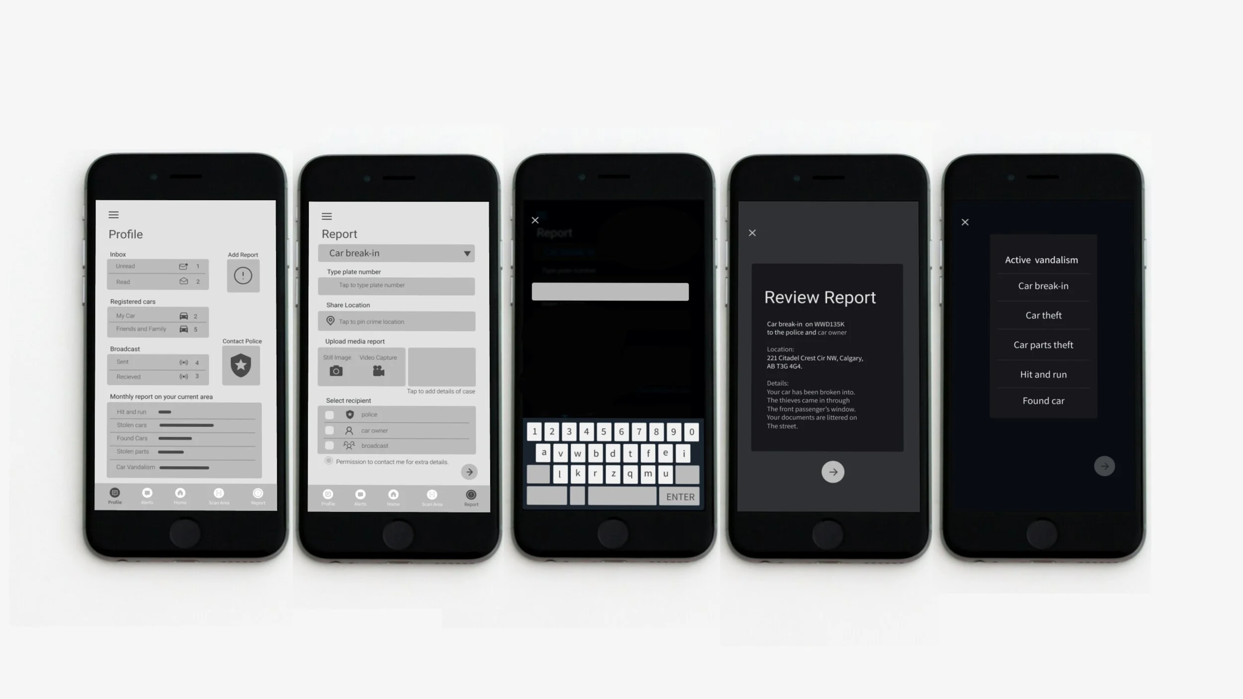
Grayscale wireframe
From the series of sketches, I developed a grayscale prototype using Figma. Developing and working with grayscale prototypes allowed me to quickly iterate and test out components, layouts, information hierarchy, and screen flows before adding a visual identity.
Once I was done with creating a grayscale prototype, I conducted 3 rounds of user testing on my prototype. This led to further adjustment of the prototype. Finally, the prototype was tailored accurately to suit my persona’s needs. Below are the final grayscale wireframe
Branding
After design the grayscale wireframe, I had to give my product a visual identity. One that will convey the attributes of our solution. I had to come up with a suitable brand name, logo, and color scheme that will Convery the mood of our app with ease.
First I had to create a mood board, this aided with finding the right tone for our mobile solution, then I got a brand name for the product as well as a logo. Once the logo was done, I was able to extract a color scheme that would best suit our product. I had to employ empathic thinking and iterations while coming up with the right branding solution for this product.
Brand Name
To achieve a strong and lasting brand in the mind of my stakeholders and personas, the brand had to create the right impression in the mind of its users. The brand had to create the right mental image from words depicting its values and function. Words such as:
Bold, Sleek, Fast, Watchful, Persistent, Fearless, Grounded, Networking, Stealth, and Communication
From the adjectives that best describe our solution, I came up with various brand names that would suit our product. I came up with the following brand names
Cartack, Carnet, Bold Eyes, Eye On Wheels, Stritgad, Ridgad.
I finally decided to go with the brand name carnet. The name is made up of 2 words namely car and network. I leveraged the word network or communication which is one of our adjectives. The name put in simple words is all about cars communicating with one another or cars networking. This is a core feature of the app.
Mood board
I created a mood board that would help develop a mental image of our product with images, textures, and colors. This went a long way in helping me come up with an identity.
Logo design
I decided to create a logo from two words, “car” and “network”. The logo depicts stealth, speed, and stability in the minds of my persona. The sports car is an icon that best defines speed in our services.
The app's core functionality is the networking of cars. It comes with a wide range of communication among cars, society, and the authorities. At present when we talk of communication, most of our mind goes to large satellites and wireless networks
Logo concepts
Satellite concept one
The logo is broken down into flat surfaces representing the flat modern graphic style. The bold and sharp surfaces representing accuracy, boldness, and speed while the curves represent flexibility.
Satellite concept two
The logo is broken down into flat surfaces representing the flat modern graphic style. Its speaks of observation and focus. It represents an AI with emphasis on the eyes as it constantly monitors the environment. The bold and sharp surfaces representing accuracy, boldness, and vigilance while the curves represent flexibility.
Fast and sleek car concept
This Logo represents speed, accuracy, stealth, and focus. It was designed to evoke accuracy and speed in the mind of viewers.
I tried out different variations and color schemes for our concepts
I decided to try other flat concept designs for my logo
final selection
Satellite concept one
I finally chose satellite concept one with the below color scheme. However, I decided to try out more texts options that would anchor with the logo.
Font variations
After selecting a logo, I now went further to get a simple font face that would suit the logo.
After generating various logos for my product, I finally selected a logo that would best identify with my personas as well as represent solutions for their specific needs.
Factors I considered include:
Nature of product
nature of persona
Color symbolism
The Product deals more with communication and stealth. It has a futuristic look and speaks of boldness and flexibility. The large surfaces speak of boldness, its straight and pointed lines speak of accuracy and focus while its curvy lines speak of flexibility. I made use of professional blue shades of color because of the nature of people I interact with through our solution; this includes the local authorities and the community. White stands for pure intentions as our foundation.
Ui Elements
Color scheme
From the branding process, I extracted color for the UI. Considering the nature of our app, I had to go with a dark theme to convey the mode of o the app.
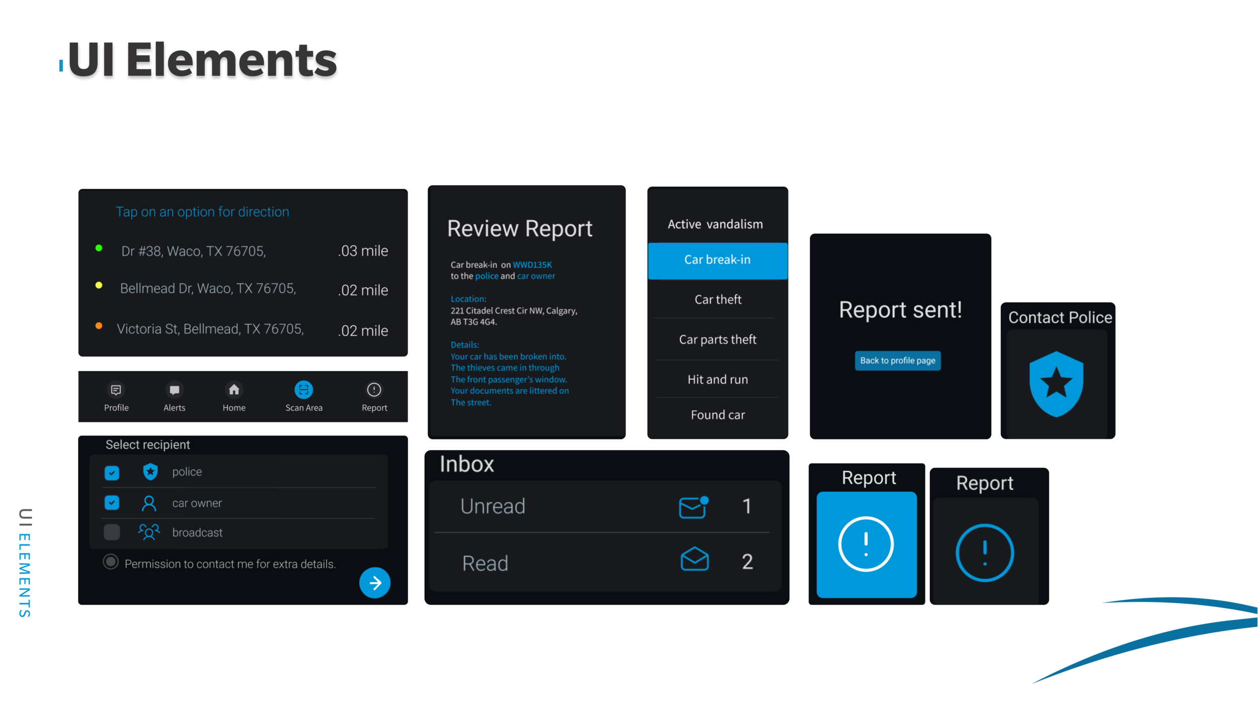
Ui Elements
I designed a flat UI theme for the app. Bearing in mind that it is an Android mobile, I worked with the android material design technique.
Dimensions
I had to work with the grid system with the sole aim of maintaining consistency in my design across all pages of the mobile app
Contrast Checker
After picking my brand colors, I had to run a Contrast Checker on all my brand color variations for a globally acceptable color pallet, making sure that all my color combinations met the global standards and requirements.
High fidelity Wireframe

Once I had gotten my logo, brand colors, and UI elements designed for all
states, I went ahead and converted the grayscale wireframe to colored wireframe for prototyping. I carefully utilized the key primary color on the solution. The intention of using the blue on black was to register the brand identity and style on the mind of the user while he or she engages the services of the app.

For a more in-depth walkthrough of the hi-fidelity prototype, please click the link below

Next steps
The mobile solution has a lot of capabilities, I would like to integrate a heat map section on cartnet which will help identify unsafe areas to pork cars. I would like to explore multi-platform capabilities on the carnet. A smartwatch application for quick accessibilities and scanning of the area would be integrated. This will be after series of empathic researches and iterations to fully understand how the smartwatch integration would best service my stakeholders and customers at large.
Once a robust solution has been attained, I will engage the services of a mobile app developer the develop a minimum viable product. (MVP)

key learning
This project has really changed my thought process towards finding solutions to everyday conflicts. I learned the importance of research and the role of iteration in fine-tuning a solution to best suit a client. A key take-home from the process is to approach every project or problem space with an open mind and allow the research to generate a solution along the way. Sometimes a designer can be faced with the temptation of trying to influence or suggest a solution for a problem space. Unfortunately, such only satisfies the designer’s need and is not a human-centred approach to problem-solving.
I understood the importance of patience and diligence in designing a solution. Time management was a key character I developed on this project. With all these experiences I have learned how to handle future problem spaces as well as projects to help satisfy my clients better.


